
Wednesday 21 April 2010


Sunday 18 April 2010
Evaluation question 4

The stereotypical person my magazine aims to target is between the ages of 16 and 24 and either male or female. They are probably strongly interested in fashion aswell of course music. Boutiques and vintage stores are probably the most likely place for them to shop, and would probably be interested in by albums for musical collections. They'll like to go to lots of local gigs and big concerts, and basically be anything but a crowd follower.
evaluation question 6
 I used facebook to find pictures and to share them once they had been manipulated.
 Throughout the whole year, I have kept a record of all research, planning and final products on my own personal blog at blogger.com. I have used this in various ways such as uploading youtube videos, amounts of text, pictures and slideshows.
 I used this site to find different fonts for my magazine.
 I used Slideshare.com to upload my presentations after creating them on powerpoint.
 Scribd is used for uploading essays.
 I used a memory stick on a number of occasions to transport saved work to and from college.
 I used a camera to take numerous pictures for my magazine.
And finally I used my laptop on a number of occassions to complete my works on all the above programs. I also used the school computers and laptops in order to complete photoshop work.
Wednesday 14 April 2010
Tuesday 23 March 2010
Changes for final

I did this background in an artistic way taking inspiration from Rankins artwork online. First of all, I teastained a plain white piece of paper, and once it had dried I taped loads of masking tape all over the page. I then rubbed in bits of mud and sprayed loads of hairspray so taht it stuck. I then scanned it into the computer and uploaded it onto photoshop for my background.
Wednesday 10 March 2010
new images for mag


After considering the genre of my magazine, I decided to change all of my iamges as they are too glamourous and not relevant. I think these new photos work really effictively by changing the makeup and hair style used. I did dark eyes to aceentuate the size and colour of them, used a highlighting serum on the cheeks and lids to accentuate them and a deep red lipstick which matches her nails. I took the hair from the face to make the features of the face defiant.
The origianl inspiration for these photos was taken from Rankin.
Monday 8 March 2010
Thursday 25 February 2010
Class feed back
Framing a shot, including and excluding elements as apporopriate:
Includes appropriate props and features and settings, picture on the front cover looking up to the audience makes them feel powerful and creates eye contact with them making it inviting.
Using a variety of shot distances as appropriate:
Good use of a different range of shots including a close up, mid shot and long shot.
Shooting material appropriate to the task set:
No props are used, and outfits could be used more effectively to fit the genre. Pictures on the double page spread is possibly too seductive.
Selecting mise en scene, including colour, figure, lighting, objects and setting:
Good lighting and setting used and a good choice of colours throughout, very feminine though if wanting to be used for males also.
Manipulating photographs as appropriate to the contcxt for presentation including croppping and resizing:
Pictures are cropped and cut out well and gives a neat presentation. Also, images are edited well in terms of colour, saturation, brightness etc.
Accurately using language and register:
Language is too short and vague, consider expanding for relevance, mainly just needs to be completed.
Appropriately integrating illustration and text:
Too many different fonts used, but text and images fit well together. More illustrations needed.
Showing understanding of conventions of layout and page design:
Simple and minimilistic layout, possibly needing to be more chaotic. Adding more text that are relative.
Showing awareness of the need for variety in fonts and text size:
The text is varied, looks effective but need to be careful not to use too many fonts thruoghtout so that they follow through effectively.
Using ICT appropriately for the task set:
Photoshop is used effectively for the images in terms of cutting out and editing. Also for the text and background on the front cover.
Overall, after looking at the feed back from my peers, I think the overall level I recieved as a level 3, giving me a mark of roughly 41/42 out of 60.
Wednesday 24 February 2010
Warp Records Research
WARP Records


Above is the 20th anniversary logo for warp music record label. The picture beneath is of Steve Beckett (right) and Rob Mitchell (left), who were the original founders of the label in 1989.
The label is an independant English label founded in Sheffield although later moved to London. It originally is noted to find the most succesful electronic music artists.
Their very first release was named 'A track with no name' by the Forgemasters and produced by Robert Gordon. The follow up track of this was 'Dextrous' by 'Nightmares on wax', which sold 30,000 copies in comparison to 500 with the first release. By the fifth release, the label achieved it's first top 20 chart record with 'LFO' by LFO. It sold 130,000 copies and hit number 12 in the UK chart in July 1990.
The first album that Warp released was called C.C.E.P by Sweet Excorcists in 1991, which was also the year that the original producer, Robert Gorden, left the label.
From 1992, the label went on to release various singles and albums under the heading 'Artificial Intelligence' which experimented with different artists in the electronic music genre. For example; Aphex twin, Autechre, B12, Black Dog, Richie Hawtin. Originally, all the albums were gatefold sleeves and coloured vinyls with covers by 'The Designers Republic' or 'Phil Wolstoneholme'.
As the label established, artists widened and the influential DJ Andrew Weatherall and Red Snapper and the experimental hip hop group Antipop Consortium were included.
Warp10, consisting of influences, remixes, and classics was a 6 disc compilation released in 1999. It featured early acid house and techno music that influenced the label and the artists as well as classic tracks from the original warp catalog and new remixes of Warp material. This was a celebration of the companies 10th anniversary.
In 2000, the label moved to London alongside its merchandise store 'Warpmart'.
Rob Mitchell, co-founder of Warp, died in late 2001 after being diagnosed with Cancer.
In 2004, Warp launched an online music store called Bleep. On 27 September 2004, Warp released its second music video compilation named 'Warpvision' which contained most of the videos from 1989 until 2004.
In more recent times, the label has expanded out of solely the electronic music and began to sign rock bands such as; 'Battles', 'Born Ruffians', 'Maximo park', 'Gravenhurst', and 'Grizzly bear'.
Last year for the companies 20th anniversary, they toured concerts in Paris, New York, Tokyo, Berlin, London, and of course it's hometown; Sheffield.
Friday 12 February 2010
draft of double page spread

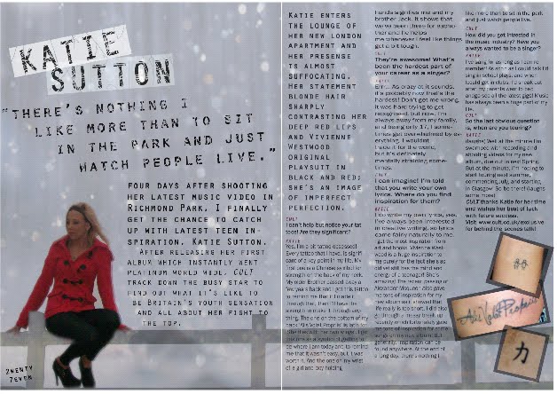
This is a rough layout of my double page spread. I have used the same person from the image on the front cover and on the left hand side will be the interview. On the left page, I used one of Rankins pictures for my background, but when I come to the real piece, I will edit this by hand and make an effect similar and then scan it back into the computer. I like the image on the left as she looks flawless but once again may have to use a different person for my images as she looks slightly too 'pop'. I like the quote at the top of the left hand page as it links back to the slogan of the magazine; 'individuality is the new religion'. And using the colour palet of black red and white I think looks effective and is suitable for both genders. On the right page, I think the black paint splats give an effective look of 'imperfection'. Which creates the edgy look I'm looking for. I'm unsure as to wheter I want the red back ground or to keep it white as a contrast to the left page. As shown below in the double page spread of Rayguns that I analysed.
Thursday 11 February 2010
Rough draft contents

This a rough idea of the layout of my contents page, taking inspiration from another of Rayguns front covers shown below:

However, when I come to make my final piece, I intend to change several things. I would like to change the image to make it fit the genre more effectively, possibly by printing the page out and putting effects such as masking tape tea stains, and charcoal effects on by hand and then scanning back into the computer. I love the style of lettering I have used, i tried to find a font that had a 'scratched' out effect but couldn't so adapted it myself but doing the font and then just scribbling over the lettering with the eraser in complete opacity. I also like how I have kept the slogan at the top of the page. However I would like to change the layout of where the writing is like on the Raygun front cover above. I like how the words contents is on two levels as to me this connotes that the magazine is for a variety of talent not just one.
Wednesday 10 February 2010
mock up front cover

This is my first final draft of my front cover page. On my next front cover I must change the contrast/brightness of the main image to fit in with the colour schemes and style of the rest of the page. I need to also have a mess around with the layout to see what works where. I do like the font of the text on the left hand side as it gives broken look.
When I come to adapting this into my final piece, I would like to make several changes. First of all I think I will have to change the images as they come across too 'pop'. Also I am going to print the page off in colour, and do some effects by hand with ideas coming from Rankin (shown below)


I love the images Rankin creates as they are so unusual and unique and give an edgy look to say the least. I love the idea of the stiching look, I would possibly like to use this or the masking tape idea for my front cover with perhaps and image like the pose of Kylie Minogue in the first image.
front cover so far

This is the first draft of the layout for my magazine. I have not yet included the words I want to include in my final magazine but have chosen the image and title for the font. I have also included a barcode and issue number in the bottom right hand corner. In the bottom left hand corner I have encorporated a recycling sign, inspired by on of the Raygun front covers. I also edited the back ground to a grained effect.


Tuesday 9 February 2010


double page spread style model analysis

This double page spread is from the RAYGUN magazine which I am using for inspiration for my magazine. I love this spread as it carries on the unique style that is portrayed from the various unusual front covers. I really like the contrast between the two pages how the one on the left is black with with white and red writing and the right page is white with black and red writing. The unusual images encoporate various other colours that clash with the orginal colours but still work really well to maintain the 'edgy' style.
I love how David Corson uses fonts to make the words seem muddled up and disjointed, i think it looks really effective and stylish. I also think using the black and white pictues on the right hand side works well in contrast with the bright colours used on the left.
Contents page style model analysis

First of all I like the minimilistic layout of this content page. Encorporating only one image, to me, gives a sense of sophistication. Also, the image used is very powerful and takes up at least half of the page, causing much of the readers attention to it. The pose she is in is also quite different making it stand out. I like how her feet are in the air, almost kicking the word contents, giving a feel of attitude.
I like how the neutral colours of teh back ground (Beiges blacks and whites) correspond with what the woman is wearing also, which also adds an amount of sophistication to the page. I also like how the top of the bag is black and slow fades into a more neutral colour creating a dramatic feel.
Also I love how the word contents is split onto 3 lines making it slightly different and unusual and how the lettering is a crisp white which stands how really nicely against the black background without looking tacky.
The subheading in the column of writing on the right look effective with the right arrow at the end of each word. and The slightly swirly font in bold.
Overall I really like this contents page and how the image is in a way dominating the page and the layout.
Subscribe to:
Posts (Atom)


