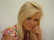
The magazine that I have chosen to analyse as a style model for my magazine production is the magazine 'Blender'. The magazine considers itself to be the 'ultimate guide to music and more' and I feel that it's genre is 'poprock', although several feedback comments found on the blender website said that they 'enjoyed the magazine as it covers various genres of music and not merely the mainstream stuff' and also that 'a musical talent was never missed with blender'. This is a similar portrayal I aim for within my magazine in that I hope to put across the message of individuality, talent and a rise within the industry. First of all, Blender uses fairly provocative pictures for the front cover, usually of very attractive women. By doing this, they are using Laura Mulvey's theory of the 'male gaze'. As for content I feel that women are more likely to read this magazine, by using these pictures on the front, I feel that it urges men to be attracted to buying it also. For example, the magazine above has a picture of Nichole Scherzinger, without a top on and merely covering herself with her arm. Nichole Scherzinger is extremely famous and well known as the Pussycat dolls main singer and the ex boyfriend of Lewis Hamilton, as perhaps a sex symbol and a celeb icon, I think using her for the front cover is a very wise move. Also going along-side the picture of her, the caption 'whats new pussycat, Nicole Scherzinger, Undressed for Success'. This phrase uses a clever play on words with the 'pussycat' and makes the reader want to know what this caption means she has done. This also relates widely to men, as they will want to know/see Nicole Scherzinger undressed.
The main title Blender, is written in block capitals in a bold red colour. Using the colour red, avoids discriminating against a female or male audience as it relates to either. Also the the words is split almost like a crack through the word to me gives the impression of imperfection, giving the idea that music isn't necessarily about imperfection, but about the lyrics, inspiration, etc. Having Nicole Scherzingers head overlapping the title also adds to the emmphasis of her attractiveness, making her the most eye catching thing on the front page and once again relating to men who will be more interested in image rather than the women who will be more interested in the content of the magazine.
The background of the magazine is very minimilistic using an 'off' white colour and using black red and a gold colour for the colour combination. This is a neutral colour range making it available for a mixed gender audience. Other than the main heading, the second largest and most noticable writing is 'Nicole Scherzinger', once again referring to her as being the main part of the cover.
The magazine incorporates many big well known musical names such as Foo Fighters, Nickleback, Avenged Sevenfold, Motion City etc and therefore give the image of a good quality magazine. Also, headlines like '40 worst lyricists ever!' are eye catching and make the audience want to read them to see what the magazine considers the worst lyricists to be. Also another thing to emphasise this and the 'inside 163 song to download now', is the box put around them, making them stand out slightly more than the rest of the text.
Having another peice of text above the main heading, I think is a good idea to bring attention to it. Becasue the heading is so bold and eye catching, you are naturally drawn to what is surrounding it and therefore the text above becomes relevant make people want to read inside to find out more.
I like the idea of having the bar code in the bottom left hand corner as it isn't too noticeable and ruins the image of the rest of the cover. Also having the issue number and price just above the bar code I think works well as I feel that sometimes prices can look tacky when they are placed in a bold position.
Overall I like the general image of this magazine as it's not too chaotic and the choice of colour palet and sytle of fonts etc are relevant to the genre and style they are trying to portray.

The Raygun magazine covers are the covers I have chosen to use for inspiration for my own magazine. I love the unique and edgy style that David Corson uses to present the genre.
Firstly, the image used is very appropriate for the genre, by using the right clothes, shot, stance, and colour. The male in the image, creates direct eye contact to the audience but still gives a sort of blank look in his eyes making it seem like he's in a sense 'in a zone'. I really like the fonts used and how they look like the opacity has been changed to create different tension in the writing. Also, the magazine cover gives an 'imperfect' feel, which works really effectively. This has been done by the random positioning of the texts and the almost scratched out effect, also how the writing isn't perfectly horizontal, but on a slight angle. The colour scheme used is very appropriate as it gives a vintage look with the little bits of red used giving it a more stand out look. I like the logo they used in the bottom left corner of a recycling sign, firstly because it portrays a good moral, but also look effective. I like the Raygun magazine covers so much because they don't stick to the usual conventions of magazines, but create a whole new unique image which is what I aim to portray in my magazine.

This is another example of a Raygun magazine by David Corson. This seems somewhat different to the first Raygun cover I analysed but still portrays the same unique image and not the usual conventions of a magazine cover. First of all I love how the image is printed several times on the same pagey but just in different opacity. I also like how the colours used (mainly blue) have been toned in different ways to create almost blocks across the page in different brightness. I like how the title has been positioned, totally central and in a crisp white making it stand out very effectively, which is important as the name is what you want the audience to remember. I like the positioning of the barcode on this cover also as it isn't in the usual place of a bottom corner, but bang in the middle of the page and turned vertically. I like how the magazine incorporates a series of white lines beneath the title that gives the image of almost being acidental but once again create that feeling of imperfection but fits the genre perfectly. This aspect is one I need to follow more closely in my magazine to ensure that I don't make it to formal. Going back to the image used, I like how it isn't a very crisp and definate image. It's slightly blurred and unclear and incorparates direct eye contact with the man on the right but a feeling of drifting from the man at the very front. Overall, this is another example of the conventions I will aim to follow for my own magazine.
 Above is a third example of a Raygun magazine by David Corson. Again this is totally different to the two previous but still follow the same conventions of originality and creativity. First of all I love the symmetrical mirror image effect used, making one upside down. The fact that the image almost looks like its been painted also creates an amazing effect, and eye contact is still portrayed. I love how random the lettering is used, for example the title is totally randomaly spaced out but once again follows the conventions for the genre of the magazine. I love the yellow used on the cover as it creates a brightness to the magazine, and also love the efect of almost a paint splattering it's that random. I like what looks like a finger print on the side of the image, it adds to the edgy unusual look. In the top left hand corner, I like how small the writing is as it almost gives the impression of being the least important part of the page, coming after the title and the image, which works perfectly as the title and the image is what will first draw the audience to the magazine.
 Although this doesn't necessarily fit the genre of my magazine, it has some aspects that I possibly would like to use for my own magazine. First of all, the image used creates a sense of power by the low camera angle used, which is appropriate for the genre of rock, which is supposed to portray power in the music. I also like the photostrip look down the left side of the page. I don't however like the how chaotic the page looks and all the different colours used. In my magazine I want to stick to more neutral colours and a minimilistic look. I do like the font used for the "100 greatest gigs ever!" with the scratched out look with white font making it look edgy and makes it stand out.